

How do you make the perfect playlist?
For my Visual Design class at General Assembly, we were tasked with creating a landing page for a fictional startup called Beat.Box.
In the brief, Beat.Box is described as an app dedicated to creating personalized music playlists for 18-25 year-olds. It takes into account their lifestyle, personality, and mood to create "perfect playlists."

How do Millenials listen to music?
I interviewed 6 people in their early 20's about their music listening habits. I saw two personas emerge. These are not mutually exclusive labels. They're meant to act more as ends of a music-listening spectrum: public vs. private, speakers vs. headphones, presenter vs. searcher, social vs. personal.
Crowd-pleaser
Wants to capture the mood of the room, or... wants to stimulate a mood within a room
Music is a facilitator of social communion
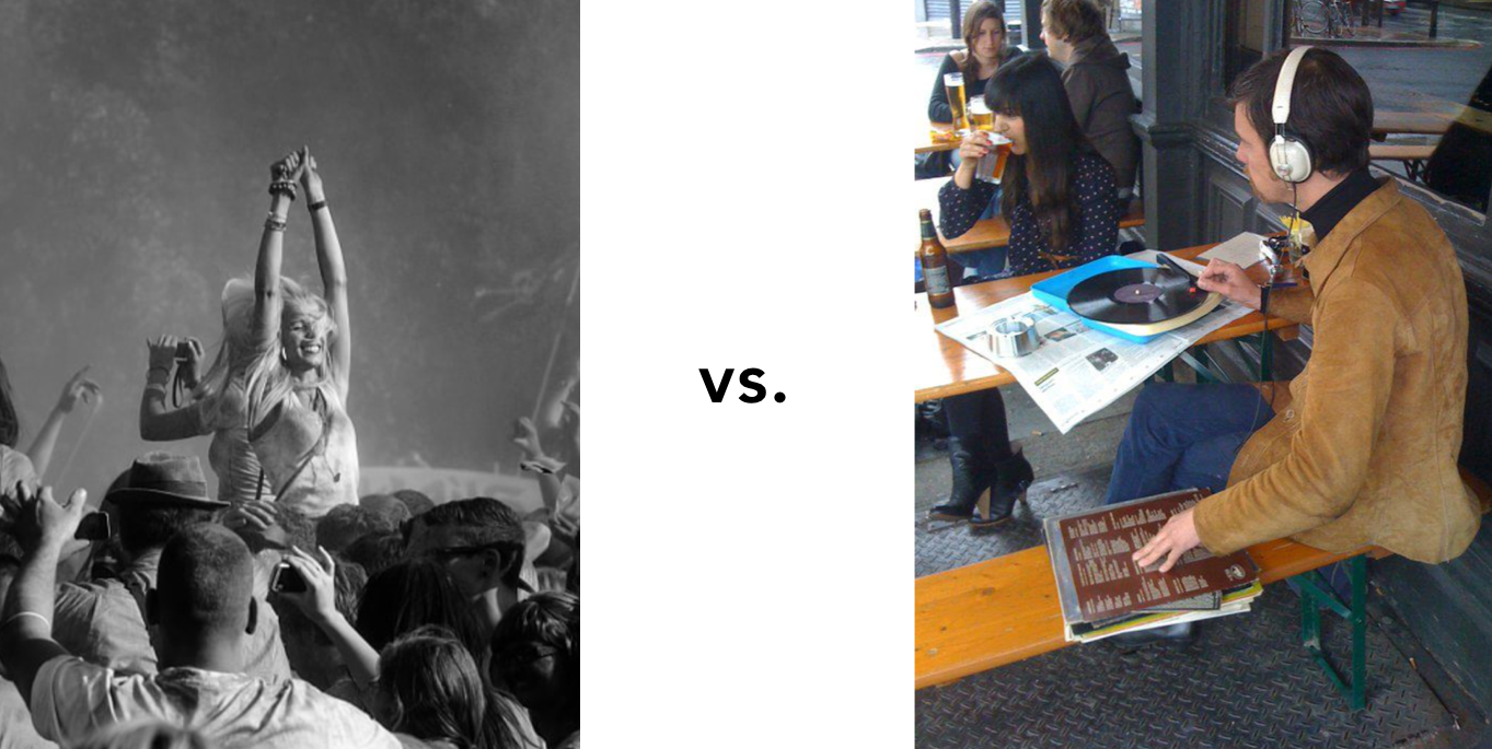
Cool-seeker
Streams new music constantly. Wants to discover the next exciting thing. Wants to curate an authentic "taste" (that's cool).
Music is an exploration of personal discovery
In a world of endless, streaming abundance, how might Beat.Box convince Millenials that their music service is relevant?
Design Principle #1 - Meld the Personal and the Social
Starting with atmospheric filters, versatile hashtags, and a dead-simple stream of content—Instagram provided users a platform to "curate their own brand." They gave users the tools to create a space that's both deeply personal and deeply social. Music, which also shares this personal/social split personality, should exist within a medium that understands and caters to this balancing act.

Design Principle #2 - Intrigue them
Young people don't like to be told what to do, what to use, or what's cool. They appreciate subtlety and discovery. They appreciate being "in" on something, whether it's a joke, a meme, or a new remix.
Snapchat, with it's cryptic UI and secret emoji language, has mastered this tone of playful exclusivity. Beat.box, which prides itself on music discovery, should strike this same note.
Design Principle #3 - Show a genuine passion for music
Whatever design decision Beat.Box makes, ask the question: will this help the music-listening experience? If the answer is no, don't do it.

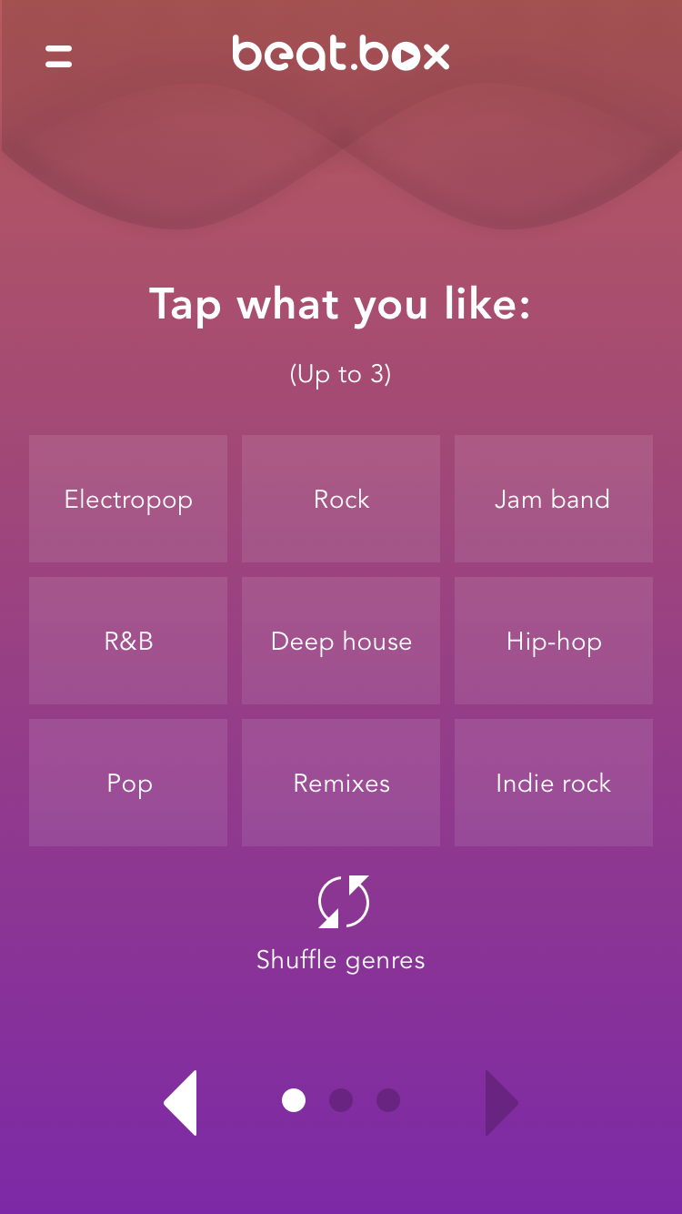
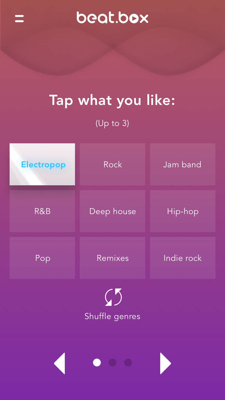
Landing page
The goal here is to provide just enough information to intrigue the user. We want quick action. Either the user knows what Beat.Box is—in which case they click to download—or they're unsure of Beat.Box, in which case they want to be impressed.

Step 1 - Pick your style
We want this "music quiz" to be quick and light-hearted. Three steps, minimal instruction, playful ui elements reminiscent of a DJ booth.

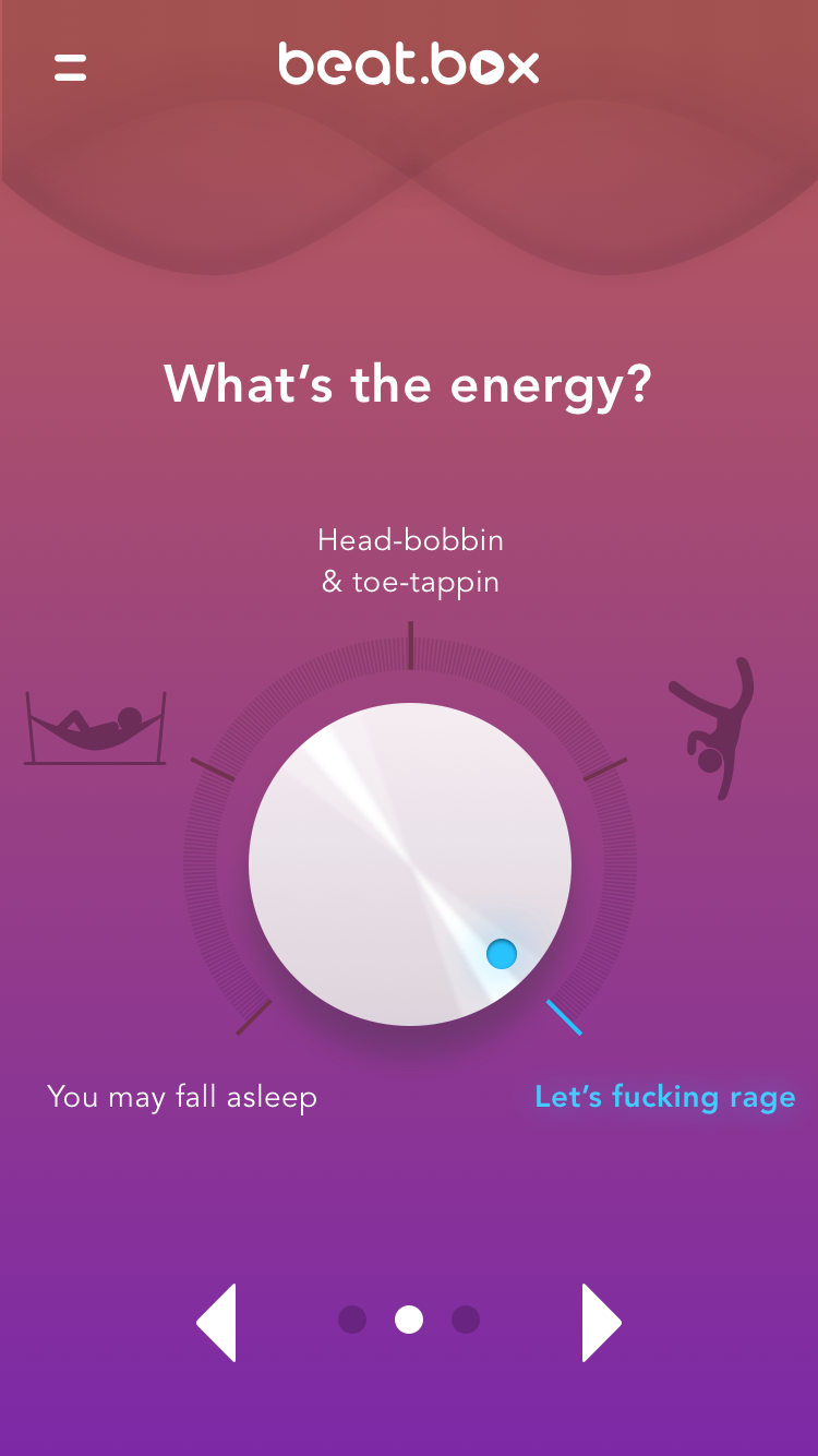
Step 2 - Pick your mood
Mixture of iconography and colloquial language signals to users that this app is unique, non-adult, and a little weird.

Step 3 - Pick the context
Raised, white, skeuomorphic controls subsist. This last task controls for the fact that music is contextual. Sometimes you're the "Cool-finder," other times times you're the "Crowd-pleaser."


Hook the user
At this point, the user's been given a playlist. The moment they try to interact with the playlist, the site will push them to download the app.
